

 MacKenzie Tyler
 October 10, 2025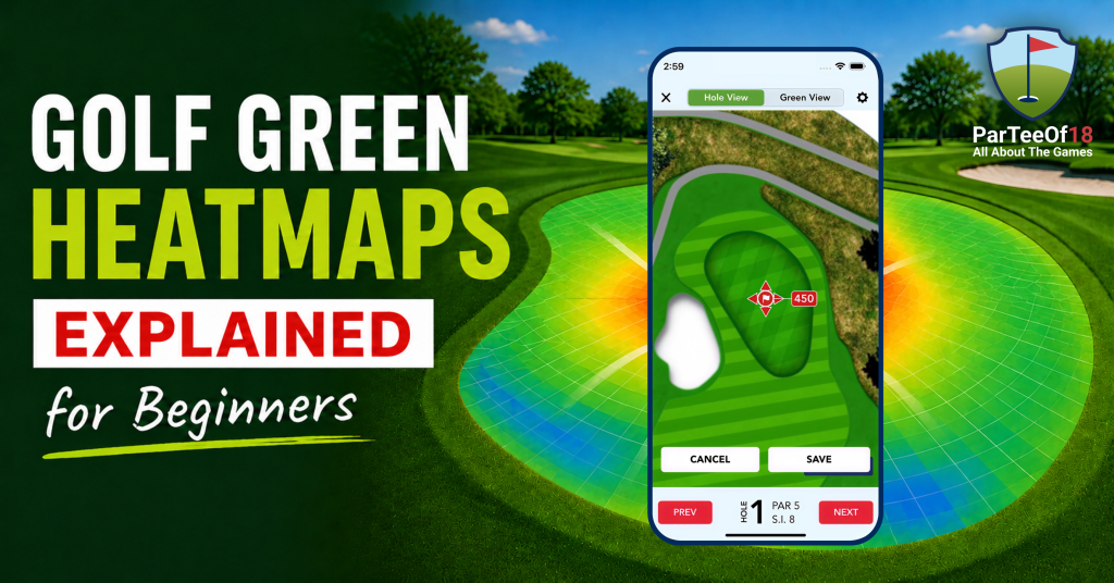
 Last Updated: July 3, 2026


A putt can look dead straight, right up until it breaks two cups at the last second. That’s the kind of moment that frustrates golfers. The truth is, reading greens isn’t guesswork anymore. With Golf Green Maps, players get a clearer picture of every slope and subtle break. And once you understand how to map a golf green, those tricky putts start to feel a lot more manageable.
What Is a Golf Green Map?
A golf green map is a detailed topographic or physical representation of a putting surface, showing slopes, contour greens, and elevation changes. Modern green maps often use high-resolution LiDAR data or laser scanning, and 3D modeling to capture minute terrain details. Golfers use these maps to predict how a ball will roll on the green, which helps with both approach shots, and putting strategy.
Rules and Legality
Green maps are generally legal for tournament play, but the USGA implements strict limits on their scale, a maximum of 3/8 inch to 5 yards or smaller (the scale limit), and a physical size of a maximum of 4.25 x 7 inches (the size limit) to ensure they don’t replace a player’s skill in reading the green.
What Are 3D Green Heatmaps?
3D Green Heatmaps are an advanced digital evolution of traditional golf green maps. They combine a three-dimensional model of the putting surface with a color-coded “heat” overlay to visualize the severity, and direction of slopes.
While standard green maps often rely on static contour lines, 3D heatmaps, that provide an interactive, high-definition view that can be rotated to analyze breaks from any angle.
How to Read a Golf Green Heatmap
Reading a green heatmap is like having X-ray vision for the putting surface. While most golfers rely on “feel,” a heatmap uses topography data to show you exactly why a putt moves the way it does.
Think of it as a contour map for a tiny mountain range. Here is how to translate those colors and arrows into a lower score.
1. The Color Palette: Understanding Gravity
The colors don’t represent grass height or speed; they represent the severity of the slope. Most maps use a “heat” scale:
- Deep Reds & Pinks (The Danger Zones): These are the steepest parts of the green. If you’re putting across a red zone, the ball will “dive” toward the hole. When you put it down, the ball will run as if it’s on glass.
- Yellows & Oranges (The Decision Makers): These represent moderate slopes. This is where most “misses” happen because the break is subtle but significant. You’ll need to play these with a clear apex in mind.
- White, Greens & Blues (The Safe Havens): These are the flatter areas. While “blue” isn’t always perfectly flat, it’s where you can be more aggressive with your line and expect a straighter roll.
2. The Arrows: The “Water Flow” Rule
The arrows are the most intuitive part of the map. An arrow always points downhill.
- Visualizing the Break: Imagine pouring a bucket of water on the spot where your ball sits. The water would follow the direction of the arrows. That is exactly how your ball will break.
- Perpendicular Arrows: If your putting line is perpendicular to the arrows, you have a heavy side-hill break.
- Parallel Arrows: If the arrows are pointing directly toward the hole, you have a straight downhill putt. If they point back at you, it’s straight uphill.
3. Calculating the “Snap”
Experienced players look for where colors change rapidly. If you see a cluster of arrows and a shift from green to red, that’s a “snap” point.
- The Transition: As the ball slows down, gravity takes over. If your ball enters a “red” zone just as it loses speed near the hole, it will “snap” or break much harder than it did at the start of the putt.
- Pro Tip: Always prioritize the color/slope around the cup more than the slope where your ball is currently sitting.
4. Strategic Approach: The “High Side”
A heatmap shows that the “hole” is actually larger on one side.
- Avoid the Low Side: If the map shows a sea of red and orange below the hole, that’s the “low side.” You never want to miss there because your comeback putt will be an uphill nightmare.
- Mapping the “Catchment”: Use the heatmap to find the “bowl” of the green. Aim for the center of the “blue” or “green” zones on your approach shots to give yourself the flattest possible birdie look.
The Golden Rule
A 3D heatmap tells you what the ground is doing, but your tempo and impact determine the result. A heatmap might tell you to play 6 inches of break, but if you hit the putt too hard, you’ll blow right through that break regardless of what the colors say.
How Green Maps Help Your Game
Many golfers see reading the green as a tricky skill that involves guessing and a lot of guesswork. However, using green maps, whether they are digital heatmaps or printed books, makes this process clearer by applying scientific principles.
When you start using these maps, you learn to understand the entire course’s shape and layout, not just the line. Here’s how they can improve your game.
1. Removing the “Optical Illusion” Factor
The human eye is easily tricked by the horizon, nearby mountains, or even the way the grass is mowed. You might stand over a putt that looks uphill because of a background slope, but the map shows a subtle 1% downhill grade.
- The Benefit: It builds trust. When your eyes say one thing but the data says another, the map wins. This eliminates that mid-stroke hesitation that leads to “deciding” on a line while you’re already swinging.
2. Strategic Approach Shots (Aiming for the “Safe Miss”)
The real magic of a green map happens before you even reach for your putter. When you’re standing in the fairway with a 7-iron, the heatmap tells you exactly where the “dead” spots are.
- The Benefit: If the pin is tucked on a narrow “red” ridge, the map tells you to aim 15 feet away into a “blue” flat zone. You stop chasing unrealistic pin positions and start leaving yourself putts that are actually makeable, significantly reducing your chances of a three-putt.
3. Understanding the “Speed of the Break”
One of the hardest things to master in golf is how speed affects the line. A green map shows that the break isn’t just a fixed number; it’s more about the connections among elements.
- The Insight: By seeing the slope percentages (e.g., a 3% slope vs. a 1% slope), you begin to internalize how much more a ball will “dive” as it loses momentum. You’ll start to realize that on a steep red slope, the “pro side” of the hole is much higher than you initially thought.
4. Faster Play and Mental Clarity
It sounds counterintuitive, but using a map usually speeds up your round. Instead of walking 360 degrees around the hole to see the slope from every angle, you take one look at the map to confirm the “fall line.”
- The Benefit: It simplifies your pre-shot routine. You identify the high point, pick your apex, and go. This reduces “paralysis by analysis,” keeping your mind clear and your hands soft.
5. Developing a “Topographical Mind”
Over time, using a green map trains your brain to see slopes even when you don’t have the map in your hand. You’ll start noticing the way drainage is built into every green and how the “basin” of the complex is designed.
- The Long-term Value: It’s a training asset. Eventually, you’ll find yourself standing on a green and “seeing” the heat colors naturally. You become a better green reader because you’ve studied the underlying architecture of the green.
ParTeeOf18 Brings 3D Green Maps to Every Golfer
ParTeeOf18 makes golf green maps easy by transforming complex topographical data into an intuitive, color-coded visual experience that eliminates guesswork on the green. Here is how the app simplifies green reading:
- Rotating 3D Green Heat Maps: For over 27,000 courses, feature integrated contour lines, high-fidelity heat maps showing slope intensity, and automatic 3D rotation based on GPS coordinates to assist with green reading. These tools are available as an add-on feature and deliver actionable insights for break, speed, and slope analysis.
- Intuitive Color Coding: Instead of complex contour lines, the app features colors to represent the slope intensity. Warm tones like red or orange signal steep gradients, and faster-rolling areas, while cooler tones like, blue or green indicate flatter, and slower spots.
- Real-Time Slope Insights: High-resolution maps depict every contour, break, and elevation change. This helps you understand uphill, downhill, and sidehill putts before you even step onto the green.
- Seamless Integration: The green maps are part of an all-in-one platform on the Apple App Store and Google Play that combines GPS distances, scoring and analytics, so you don’t have to switch between multiple tools during your round.
- Pre-Step Strategy: By providing these insights before you approach the ball, the app acts as a “pocket caddie,” allowing you to plan your line, and speed with data-backed confidence.
A green map doesn’t make the putt for you, but it ensures you never fail for lack of information. It turns a “guess” into a “plan.”
Conclusion
Reading greens has always been one of those skills that separates decent golfers from really good ones. Some rely on instinct; others trust experience but tools like Golf Green Maps bring a level of clarity that was once hard to find. They don’t replace feel; they sharpen it. When a 3D heat map shows exactly how a putt will move, it takes away that second-guessing that creeps in right before the stroke.
Over time, it’s not just about making more putts. It’s about thinking differently, seeing slopes earlier, planning smarter approach shots, and avoiding the kind of mistakes that quietly add strokes to the card. And with tools like ParTeeOf18, that insight becomes part of every round, not just a one-off advantage. The read gets clearer, the decisions get simpler, and the game starts to feel a little more under control.
FAQs
Are green maps legal in golf?
Yes, but with specific limitations. Under USGA and R&A Rule 4.3a , you can use green maps as long as they comply with size, and scale restrictions. Generally, digital maps are legal for recreational play and most club tournaments, but professional tours often have stricter “Local Rules” regarding the use of specialized green-reading materials.
Can I use green maps before my round?
Absolutely, and you should. Using them during your pre-round prep is a “pro move” for course management. It allows you to study the general “flow” of the greens, identify dangerous collection areas, and visualize where you want to leave your approach shots based on that day’s likely pin positions.
How accurate are green maps?
High-quality maps, like those from ParTeeOf18, are incredibly precise because they are built using sub-centimeter LiDAR (laser) scanning. While they are far more accurate than the naked eye, they won’t account for temporary factors like morning dew, recent aeration, or specific grain in the grass, so you still need to use a bit of “feel.”
What do the colors and arrows mean?
Think of it like a weather map for the ground. Warm colors (Red/Orange) indicate steep, severe slopes where the ball will move fast and break hard, while cool colors (Blue/Green) represent flatter, with little to no slope. Arrows act as “flow indicators,” pointing exactly which way gravity will pull your ball; the longer or denser the arrows, the more severe the break. But if a putt is completely straight up or down the direction of an arrow, it will not break to either side.
All Premium Features Unlocked
No catch. Cancel anytime




MacKenzie Tyler is a competitive golfer preparing to turn professional on the LPGA Tour. A former All-League golfer and three-sport athlete, Tyler spent nine seasons caddying at Sebonack Golf Club on Long Island, where she developed a thorough understanding of the game. In 2025, she won the Long Island Amateur at -4 over 36 holes, qualified for the U.S. Mid-Amateur, and became the first alternate at her U.S. Women's Open qualifying site after leading the field through round one.


Related Posts

9 Fun Golf Putting Games to Play (Practice Green and On the Course)
Discover fun golf putting games for the practice green and real rounds, plus the drills that back them up and...

What Is a Chip Shot in Golf? How to Hit It and When to Use It
Learn what a chip shot is, when to chip vs. pitch vs. putt, and how to hit it clean. Simple...

What Is Lag Putting? (And the 3 Drills That Actually Fix It)
Learn what lag putting means, why distance control matters, and three practical drills to help reduce three-putts and improve your...

What Is PCC in Golf? Playing Conditions Calculation Explained
PCC is the daily adjustment that corrects your score differential when a course plays easier or harder than its rating....